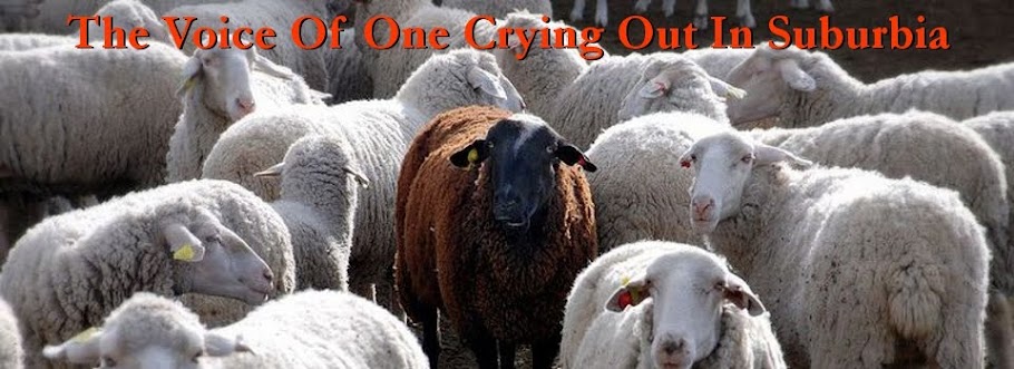
I like this fellow in the new picture in my blog header. He kind of reminds me of….me. I often feel like the black sheep in the church family. My Reformed brothers see me as a theological malcontent, someone who has squirrelly views on lots of stuff and asks uncomfortable questions on issues ranging from the church to the sword. My more organic church brothers look askance at my views on theology in areas like gender. I often feel like I don’t fit in with much of anyone. Plus the black sheep in the picture is just funny looking and makes me laugh and I can always use a little self-deprecating humor so I don’t start to take myself and my blogging too seriously.
I am continuing to tinker around with the blog layout. My goal is to make this blog easy to read on the one hand and a source for links to other important information without being cluttered on the other. I have removed more page elements that I don’t find useful just as I have removed stuff in the past that made the page load kind of slowly. I took the quotation marks out of the title because that looked weird in some links and went back to a more standardized blogger template that allows the use of quick links to Facebook and Twitter. So I hope you like it, if you have suggestion please let me know!

4 comments:
No, that is definitely me.
I like it. My only suggestion would be to change the color of the title font. It's kinda hard for me to read.
-Alan
Alan,
I know it is, i tinkered with it for a LONG time today. I will keep trying different colors and fonts. I like the picture but I knew the title would be hard to read.
Love the new picture... I see the resemblance.
Post a Comment