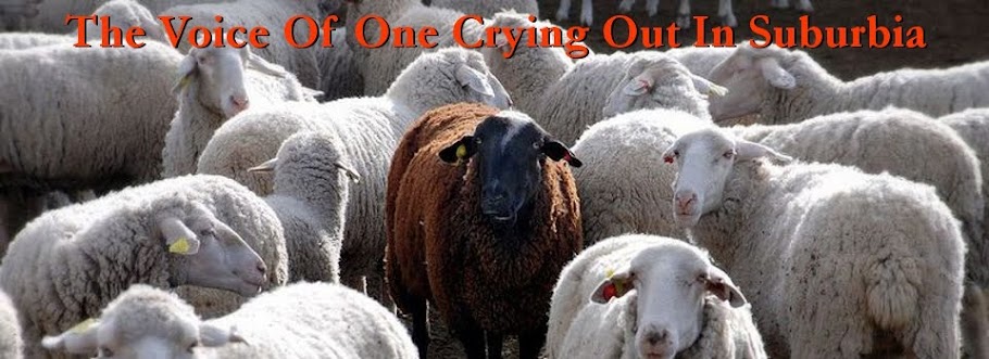
This is a much simpler, cleaner design. I think it makes reading a whole lot easier. It no longer features the tulip header, but I assume everyone gets that I am a Calvinist and thus the T.U.L.I.P. theme is not necessary.
The only downside is that all of the text that I highlighted in the old format is yellow which doesn’t show up on this. I guess I can go through manually and change it all…or maybe James has a code to fix it.

2 comments:
I like it!
Much, much better!!
This looks great!
Beth
Post a Comment